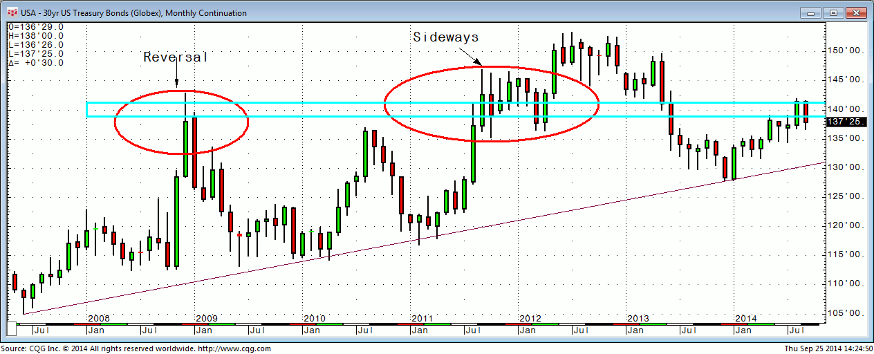
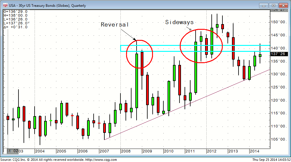
A look at the quarterly and monthly charts of the 30 year futures contract tells a big story.
Thirty year futures retraced rather vigorously throughout all of 2013. Our quarterly chart below shows five consecutive quarters where 30 year futures close lower (from the last quarter of 2012 to the fourth quarter of 2013).
Signs of the economy recovering and talk of tapering the Fed’s purchase of mortgage-backed securities and treasuries triggered the prolonged sell-off of 2013. Prior to this sell-off, the contract was at all time highs with no end to QE in sight. (The trading above the rectangle drawn in both charts came with unprecedented accommodative monetary policy and a stalled economy).
After the Prospect of Tapering is Digested
Notice where the 30 year futures contract finds support on the major trend-line that has been drawn in both charts. As the market finally found support at this level, the economic recovery was seeming more anemic with mixed data coming out and lackluster European economic data persisting. These issues, as well as geopolitical issues, contributed to a turnaround and a persistent uptrend that can be seen in both charts from January 2014 to present.
The Current Trading range is Very Interesting
If we see the market close above 137-6 at the end of the month, then the contract will have closed higher for 3 quarters and close to a price level where, when we arrived to it last, we traded sideways for a significant period. The only other time in history we traded up to this level was during the last financial crisis, and the market reversed dramatically. Also, the major trend-line drawn seems to be significant because it has held for so long.


[…] look at the 30 year futures proved very interesting. Take a look back at the entry, BIG PICTURE ANALYSIS OF 30 YEAR FUTURES: UP WHERE THE AIR IS THIN, and see the several interesting questions that the chart begged to be asked. At that time, we saw […]